
Understand what analytics tracks, and how to configure data
Table of Contents
Analytics: Understand what is happening in the Cultivation over time
The Analytics dashboard
The Analytics dashboard has three parts:
- Analytics cards - Who is performing, who needs help, and average labor load
- Filters - make selections to view data for different teams, users, harvests, and zones
- Charts - Dive deeper to collect important information over variable timeframes based on selections made in the filters
The dashboard is designed to first give growers high level information on how each grower is performing, along with the amount of work in the grow looking foward, then also deeper and customizable charts that enable leadership to dive in on historical work done for different harvests, rooms, and timeframes.
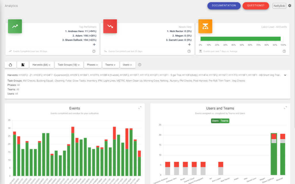
Analytics cards: Top Performers and Needs Help
The cards at the top of the dashboard are evergreen and not affected by different filter selections (unlike each chart below the filters).
The Top Performers and Needs Help cards show first the number of events completed by Users over the last thirty days, followed by a percentage that is calculated off of the average amount of events completed over the 90 days previous.
Each card can also be expanded to see a complete list of each User in the grow, and view how many events they've compeleted over the last 30 days.
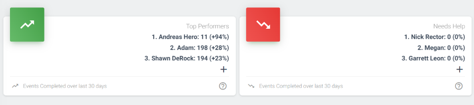
Analytics cards: Labor Load
The Labor Load card calculates the percent of average labor the cultivation has over the next seven days.
Specficially it compares the amount of Events over the next seven days, against the average amount of events over the 30 days previous.
The percent displayed shows the the next seven days vs. the average.
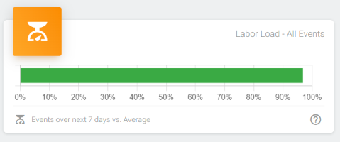
Analytics filters
Each filter works much like the calendar filters. Once you make a selection, each of the charts will update to show only the information you've chosen.
You can also view the selection you've made below the filters.
Analytics charts
There are four charts that show key information about your cultivation:
- Events - Events completed vs. overdue
- Users and Teams - Events assigned vs. completed for Teams and Users
- Time Taken - The amount of time Events take to complete vs. the estimated time
- Labor load - the amount of Events scheduled vs. the historical average
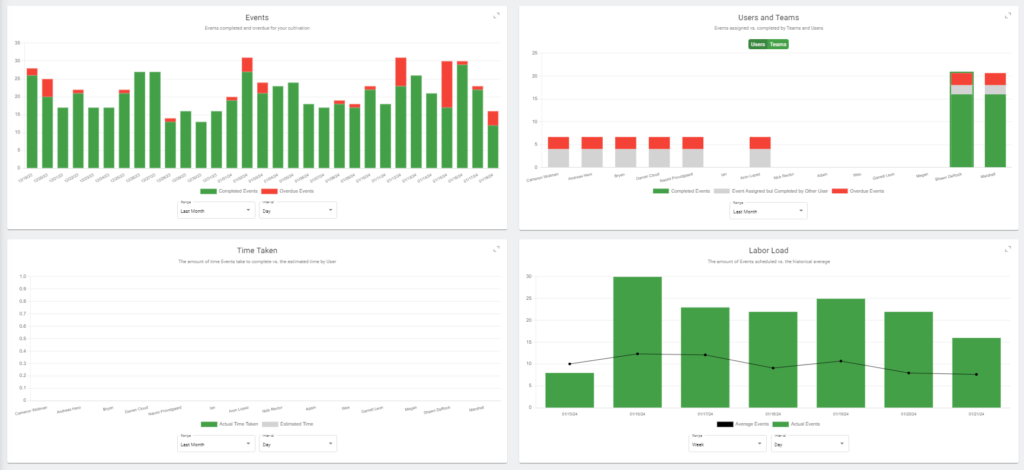
Each chart will be updated based on your selection in the filters above them.
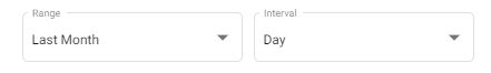
You can can also choose a range of dates, and interval of time for each chart:
You can also choose to expand a single chart and snap it to the top of your screen under the filter.
Excluding User data
By default, Analytics can only be seen by Manager and Owner level accounts.
To exclude specific Users from Analytics go into the Role under permissions and mark them as a Power User. After this is done they will no longer show up on the dashboard.
What Analytics is for
We designed the dashboard to give you critical information on what is happening in your grow, who is performing (and who isn't), while also helping you to plan work looking forward into the future.
A final note - we'll be adding more Analytics as we improve our Dutchie functionality and start collecting key plant and batch metrics.